Mobile app
2023
Designing a Mobile App for a Local Laundry and Dry Cleaning Service
Background
Click Laundry is a laundry and dry cleaning service business that wanted to expand its customer base beyond the local market. To achieve this, they needed a mobile app that could allow customers to place orders easily, track those orders, and engage with the service seamlessly. I was responsible for designing the entire app from scratch to help Click Laundry reach more customers across the city and streamline their order process.
Tools Used
Figma.
Timeline
Nov 2023
Role
Product Designer
I was responsible for the entire app design from research to final design and prototyping. There was also a senior designer was there to guide me throughout the app design as he was already designed the website for this.
Problem
Before the mobile app, Click Laundry relied solely on walk-ins and phone calls from local customers to receive orders. This manual process limited their reach to the local community, creating a bottleneck in their growth. They wanted to expand their services citywide, offer a more seamless ordering experience, and improve customer engagement.
Key challenges included:
Limited reach: Only nearby customers were aware of their services.
Manual order management: Handling orders via phone calls was time-consuming and prone to errors.
No tracking system: Customers couldn’t track the status of their orders.
Objectives
The primary goals of this project were:
Easier order processing: Streamline the order-taking process through a user-friendly app interface.
Increased customer engagement: Introduce features that enhance the customer experience, such as order tracking and referrals.
Order tracking: Allow customers to track their orders in real time. Citywide customer base: Attract new customers from across the city through digital accessibility.
Target Audience
The app was designed for busy professionals and families who need reliable laundry services but prefer a more modern and convenient solution. The target users are typically tech-savvy, living in urban areas, and looking for efficient, time-saving solutions for routine tasks like laundry. The app aimed to attract users between the ages of 20-55, primarily in metro areas.
Research & Discovery
Conducted Secondary Research to understand users
To start, I conducted secondary research by analyzing case studies, articles, and user feedback from similar laundry and order-booking apps. This provided valuable insights into industry best practices and user preferences, shaping the app’s feature set and design approach.
Information Architecture
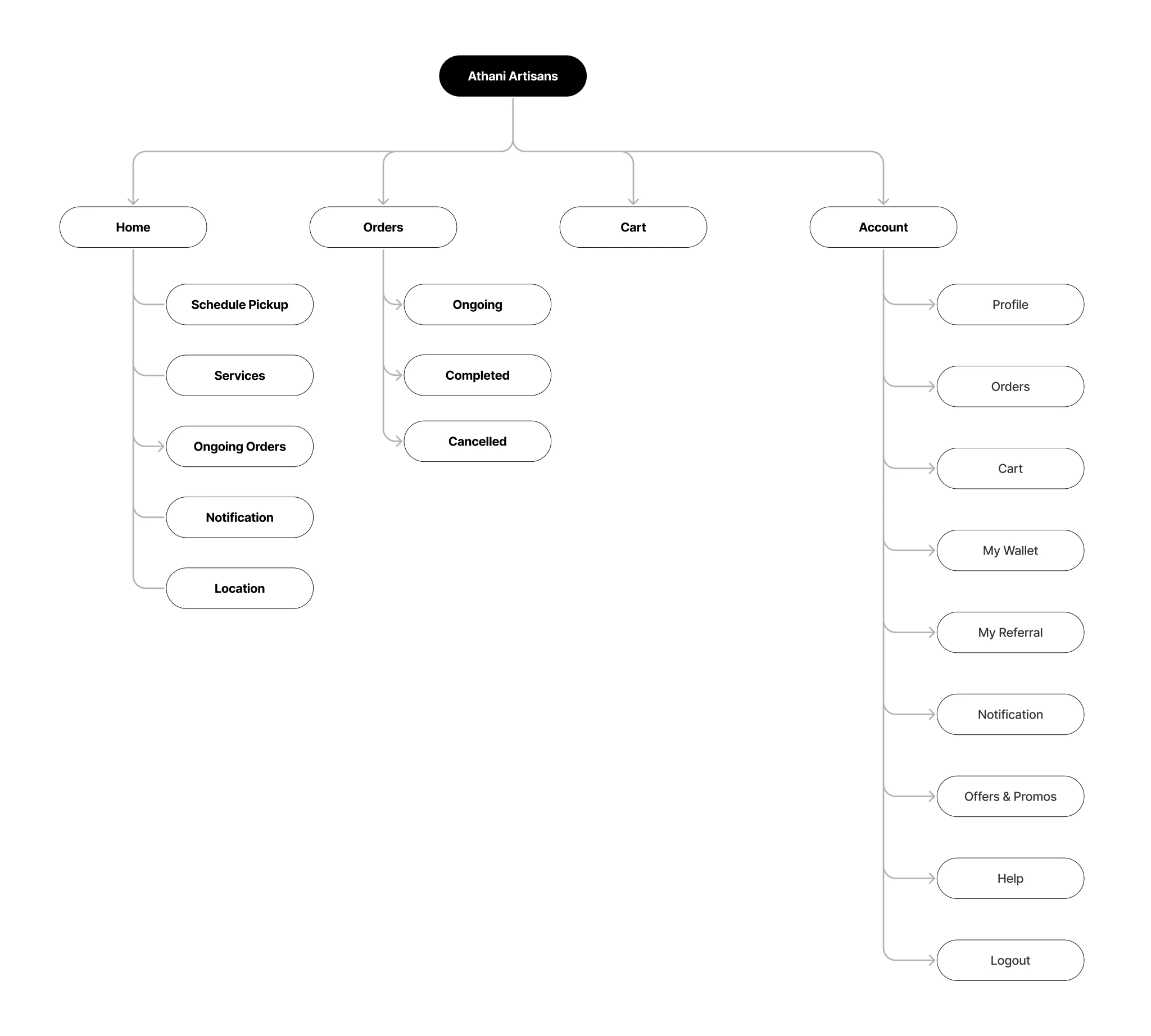
To structure the app effectively, I designed a clear and intuitive Information Architecture that allowed users to quickly navigate from the homepage to key actions like placing an order, tracking it, or accessing their profile. The architecture was kept simple, focusing on ease of use for all customer demographics.
User Flow
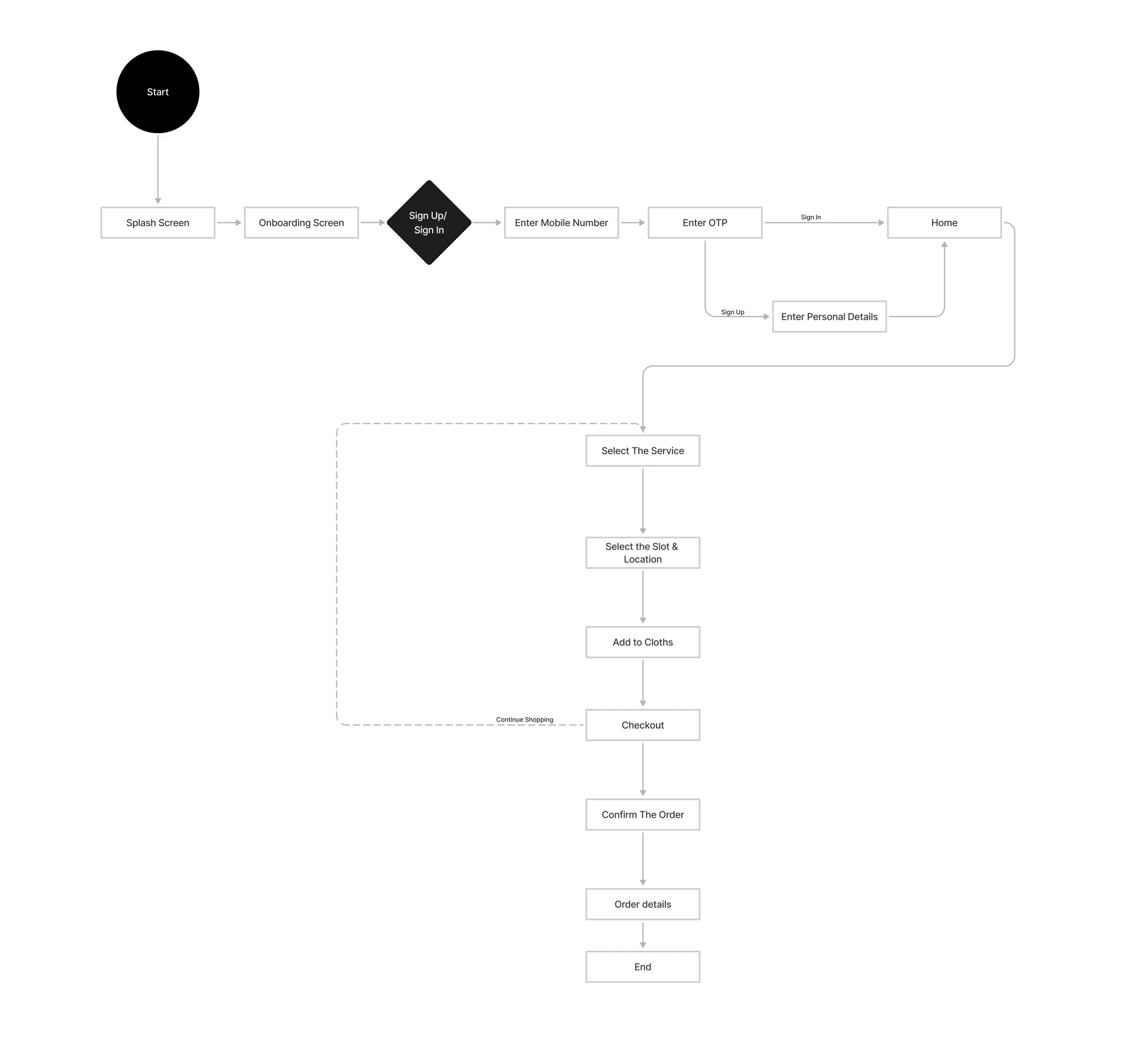
The User Flow was designed to ensure a seamless and efficient journey from order placement to order completion. This user flow was designed to minimize friction and ensure a smooth experience from start to finish, with quick access to the core functionalities of order placement and tracking. Here’s a brief overview of the primary user flow:
Style Guide
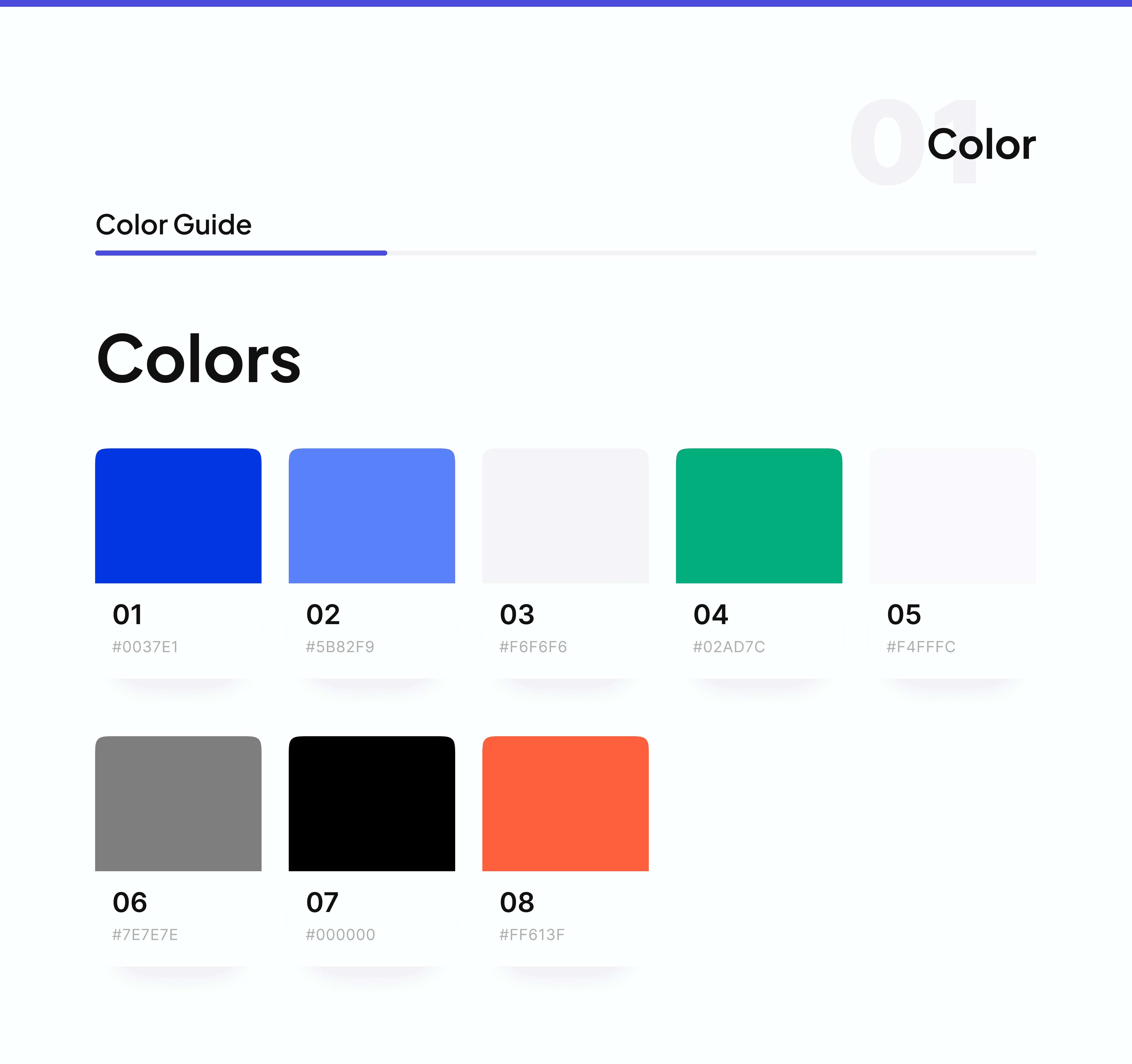
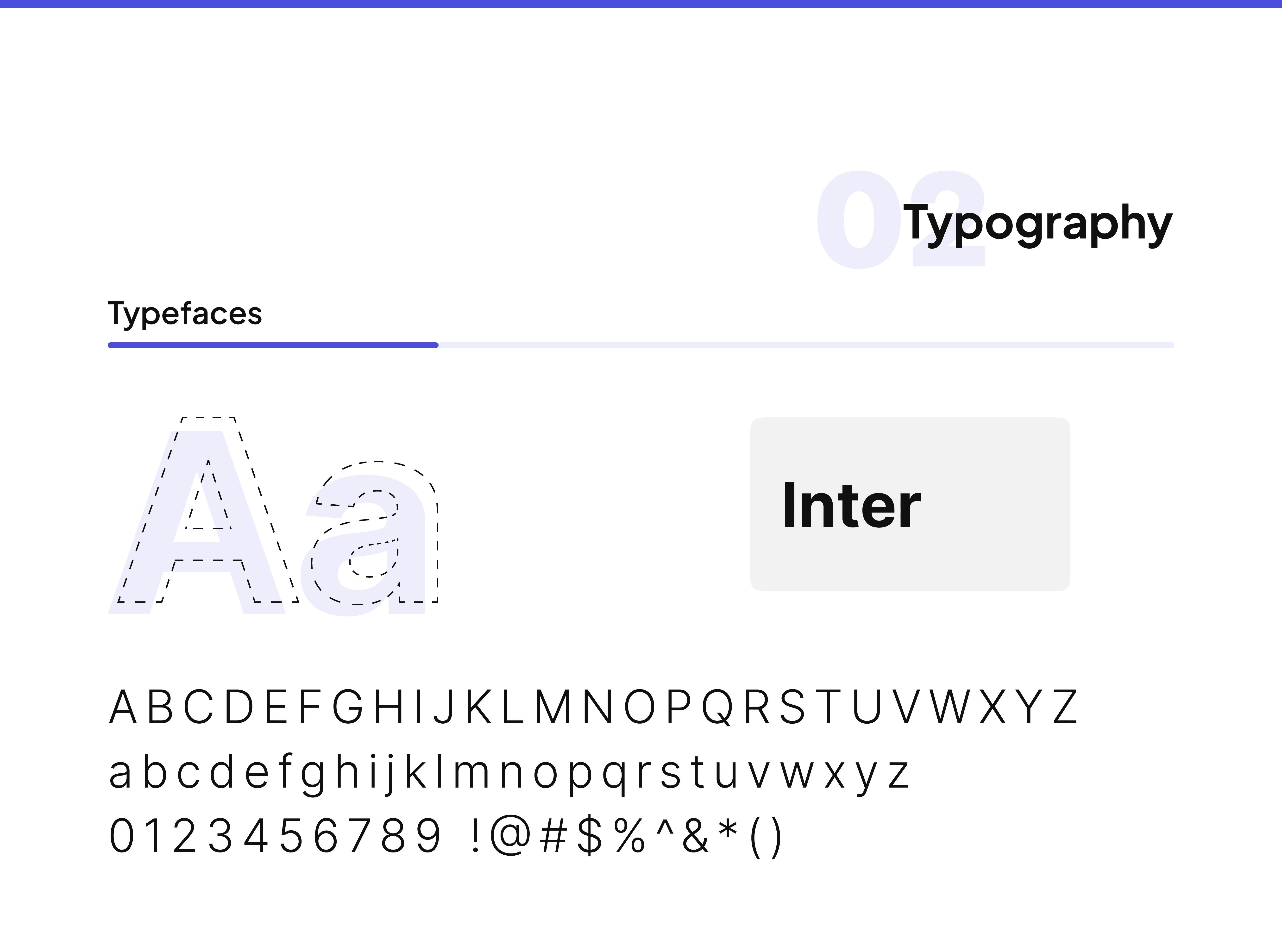
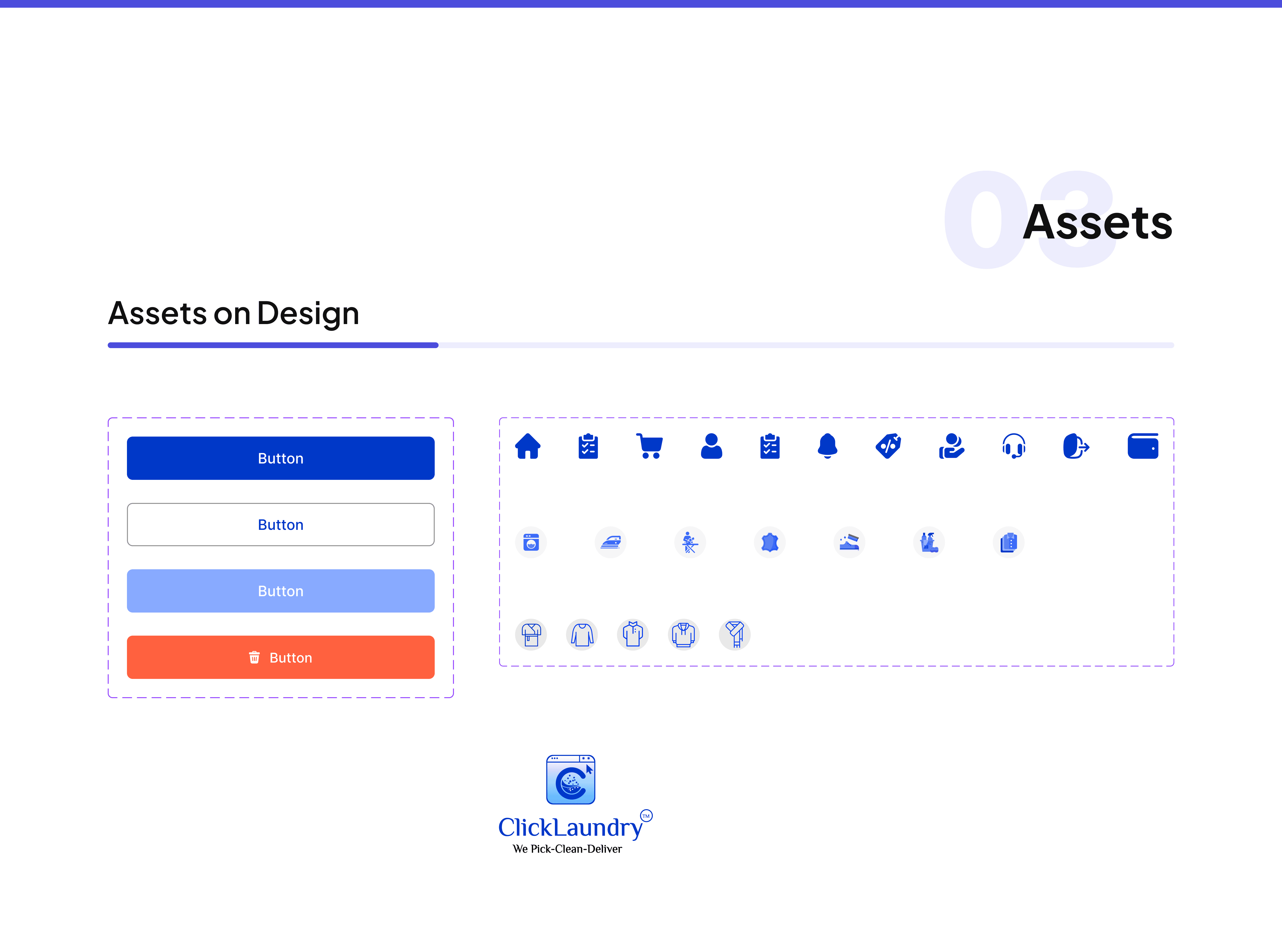
To ensure a cohesive brand identity, I created a comprehensive style guide that included:
Color Palette: A soothing combination of blues and whites to evoke a sense of cleanliness and trust.
Typography: Clean, modern fonts that were easy to read, with a focus on accessibility.
Icons & Imagery: Minimalist icons that clearly represented services like laundry, dry cleaning, and delivery tracking, ensuring the app was visually appealing yet functional.
Final Design
UI Design
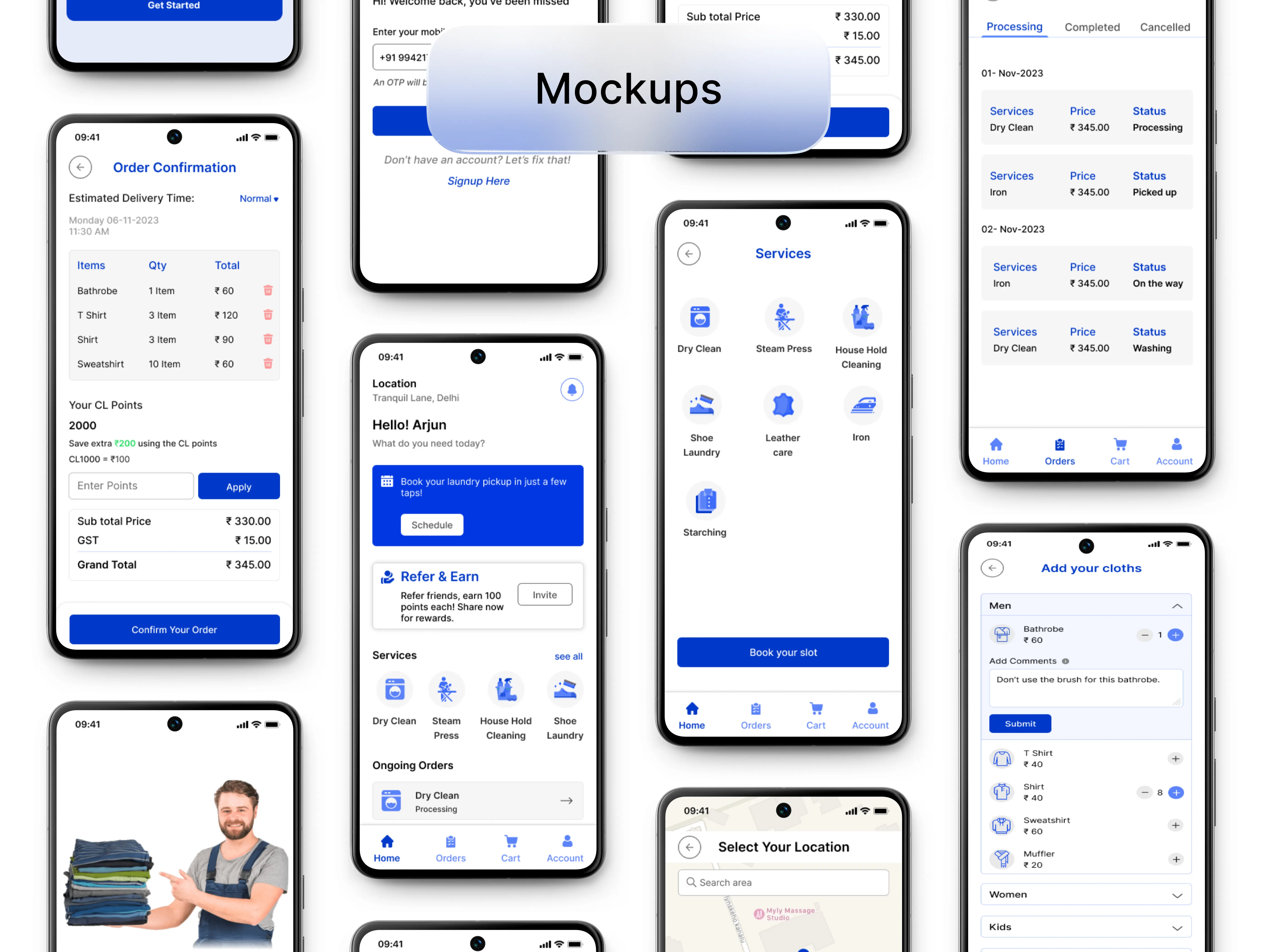
The UI Design was focused on clarity, simplicity, and consistency. I developed high-fidelity designs that aligned with the client’s branding and ensured a smooth user experience.
Prototype
After completing the UI design, I built an interactive prototype in Figma to simulate the user journey. The prototype allowed stakeholders to experience the flow from placing an order to tracking it, providing a clear view of the app's usability and design aesthetics.
You can check it out Here
How did the product perform?
Unfortunately, the product is still under development so I will have to wait for it to go live.
Conclusion
The Click Laundry app was a rewarding project that allowed me to design a digital solution for a local business looking to scale. Through thoughtful design decisions and a user-centric approach, I delivered a product that will not only improve their operational efficiency but also expand their customer base.
Thank You
