

#B2B
#product design
#end-to-end
Role
Product Designer
Timeline
4 Weeks
Tools
Figma

Overview
Imagine juggling multiple vendors, scattered task updates, and payment confusion, all while trying to set up restaurants on tight deadlines. That was the reality for Make My Restaurant. Managing vendors through WhatsApp messages and phone calls led to endless miscommunication, delays, and frustration.
To fix this, we designed a simple yet powerful vendor management app that streamlined operations, clarified payments, and made project tracking effortless. This is the story of how we turned chaos into clarity.
About the company
Make My Restaurant (MMR) is an end-to-end restaurant setup solution provider in India. The company stands out for its comprehensive approach, handling everything from initial concept design to final execution.
What was the problem?
Managing vendors at Make My Restaurant wasn’t just difficult, it was chaotic. Every project involved multiple vendors, each handling different tasks, but there was no structured way to manage everything.
Some tasks were shared on WhatsApp, some over calls, and some were just assumed to be understood. Following up on progress felt like detective work! - MMR Project Manager
Business Impact
These inefficiencies caused delays in restaurant openings, increased follow-ups, and strained relationships with vendors. Without a solution, scaling operations would become even harder.
My Role
As the Product Designer, I led the UX/UI design process conducting research, defining user needs, and crafting an intuitive solution. I collaborated closely with the CEO, project managers, and vendors to ensure the product addressed real pain points and was easy to adopt.
Research & Discovery
With a tight deadline, I needed to move fast. So, I went straight to the source, talking directly to the CEO, project managers, and vendors. These conversations gave me a firsthand look at the challenges vendors faced daily and what truly mattered to them.
From those talks, I learned a few things about what the users need:
WhatsApp wasn’t enough → Vendors struggled to track messages and updates across multiple conversations.
Too much time spent following up → Managers needed a structured way to assign tasks and track progress.
Payments lacked clarity → Vendors wanted an easy way to check pending and completed payments.
I also noticed some interesting insights:
Tech barriers → Many vendors weren’t tech-savvy, so the app had to be simple and mobile-friendly.
They needed clarity, not complexity → A clear task list, straightforward navigation, and zero unnecessary clutter.
These insights made one thing clear: vendors didn’t need another complicated tool. They needed something effortless, an app that helped them stay on top of tasks, track payments, and communicate without the constant back-and-forth.
Lean Approach
With a clear understanding of the challenges, the next step was to design a solution that truly worked for vendors, without adding complexity to their workflow.
Instead of overwhelming them with fancy features, I focused on what they really needed to get their job done smoothly:
A single place to view and manage tasks - no more juggling WhatsApp threads.
A simple way to update progress - so managers didn’t have to keep following up.
A clear payment tracker - showing vendors exactly what’s due and when. Gentle nudges. timely reminders to make sure nothing slipped through the cracks.
The goal wasn’t to impress with complexity, it was to make sure vendors could open the app and instantly know what to do, without thinking twice.
By keeping it lean and focused, we made vendor collaboration not just efficient, but effortless.
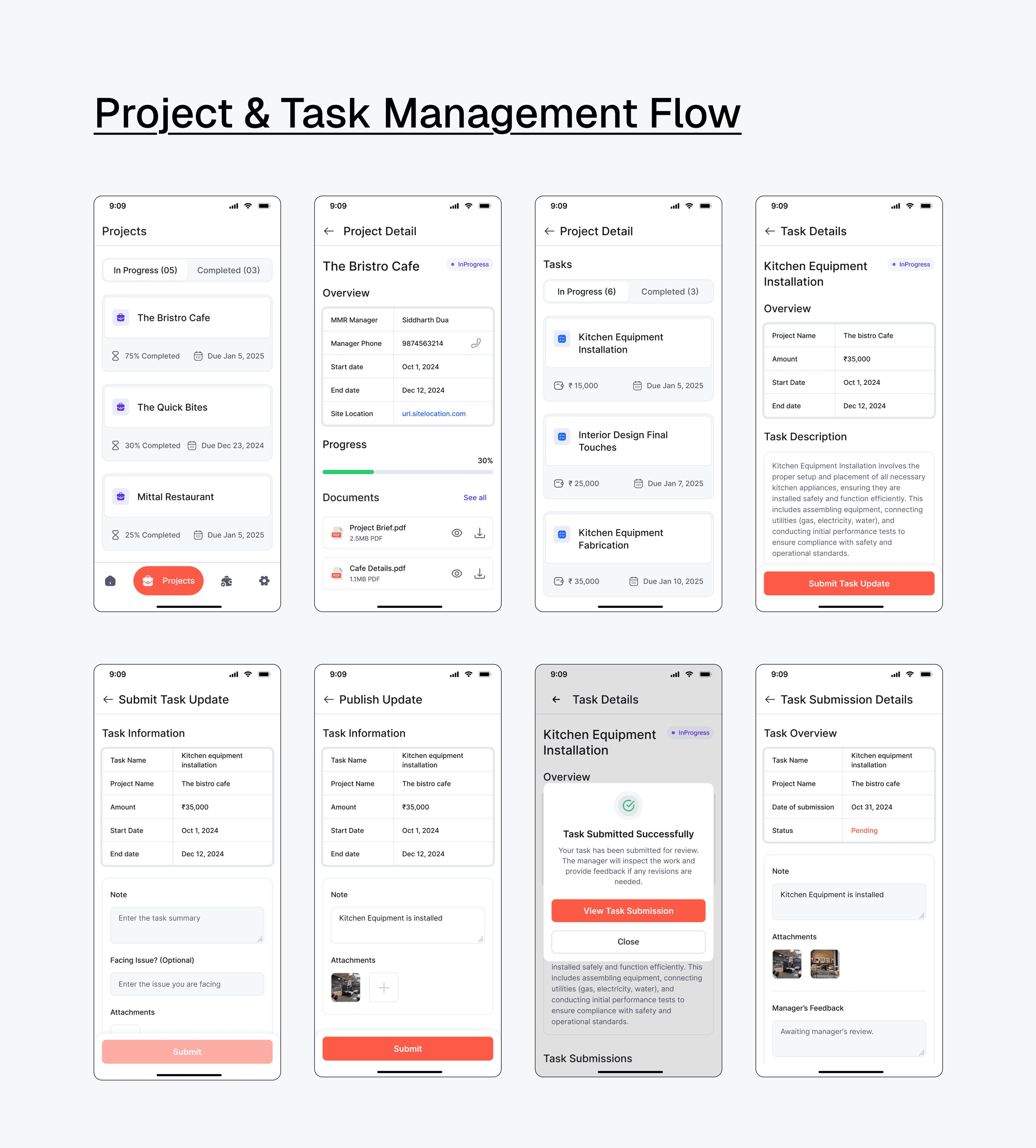
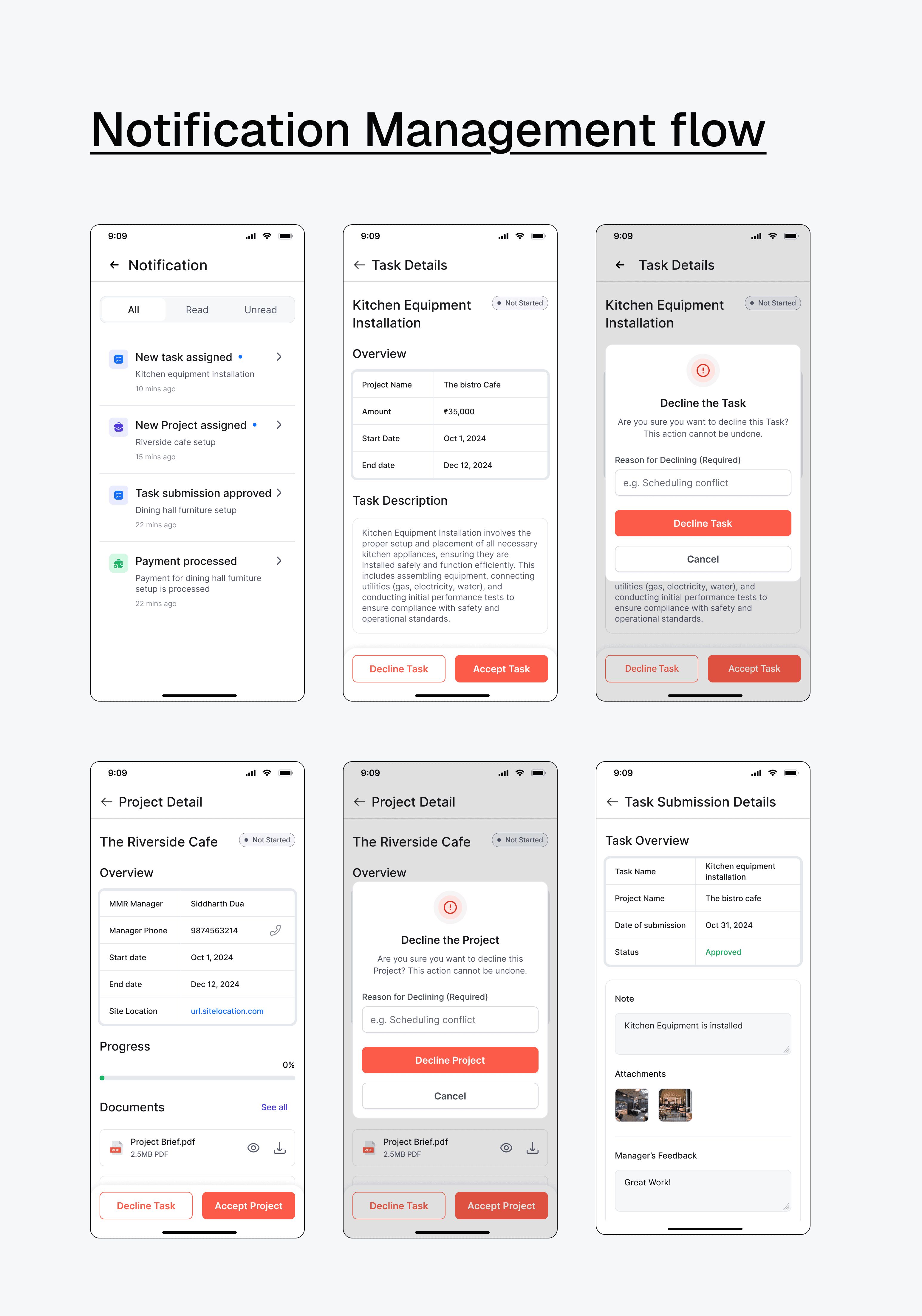
Structuring the Experience
I mapped out a seamless flow where vendors could see tasks instantly, update progress effortlessly, and track payments without confusion. Smart reminders kept them on schedule, reducing follow-ups. This meant less hassle and more time to focus on their work.


Wireframing the Foundation
Once the user flow was mapped, I moved into low-fidelity wireframes to visualize the core experience. These early sketches focused on layout, clarity, and content hierarchy, without getting caught up in visuals.
They helped me validate the structure quickly, make fast iterations, and keep the focus on solving real problems for vendors.
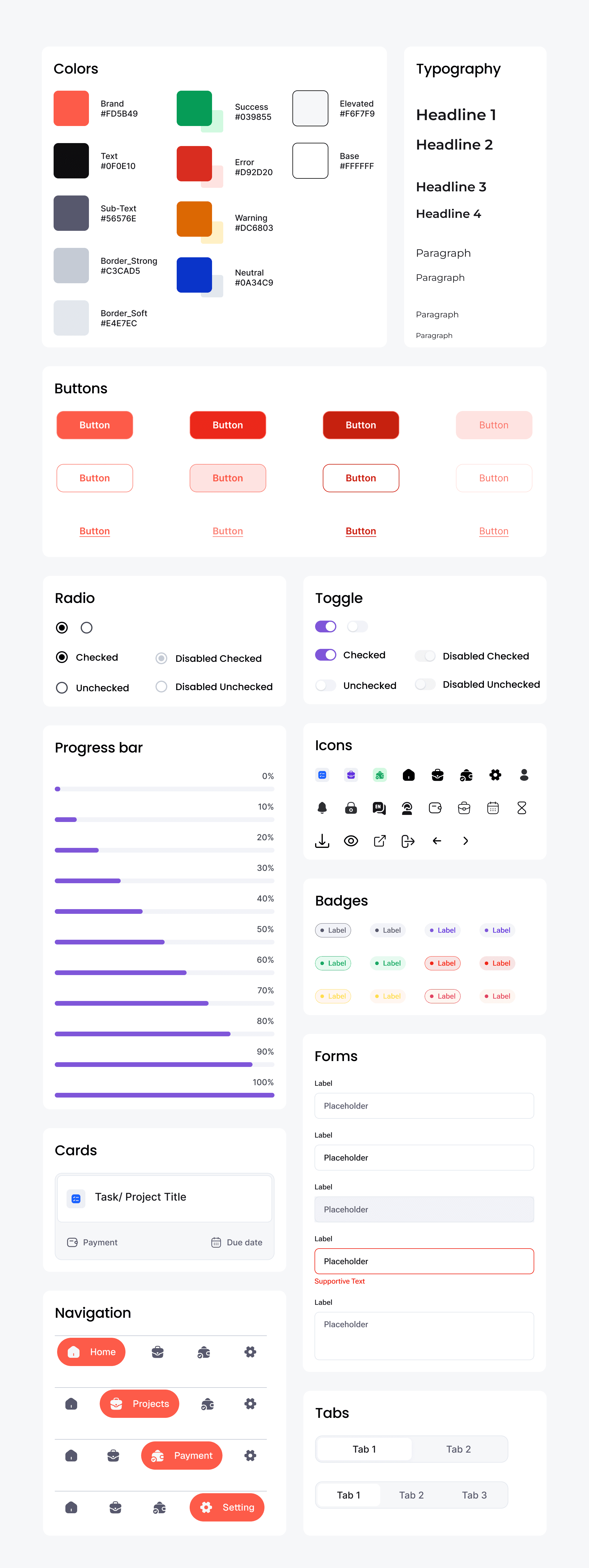
Design system
To maintain a cohesive and intuitive user experience, I established a structured style guide that ensures visual consistency across the platform.
UI Design & Prototype
With the design system in place, I brought the wireframes to life through high-fidelity mockups. The goal was simple: make the app feel familiar, approachable, and effortless to use.
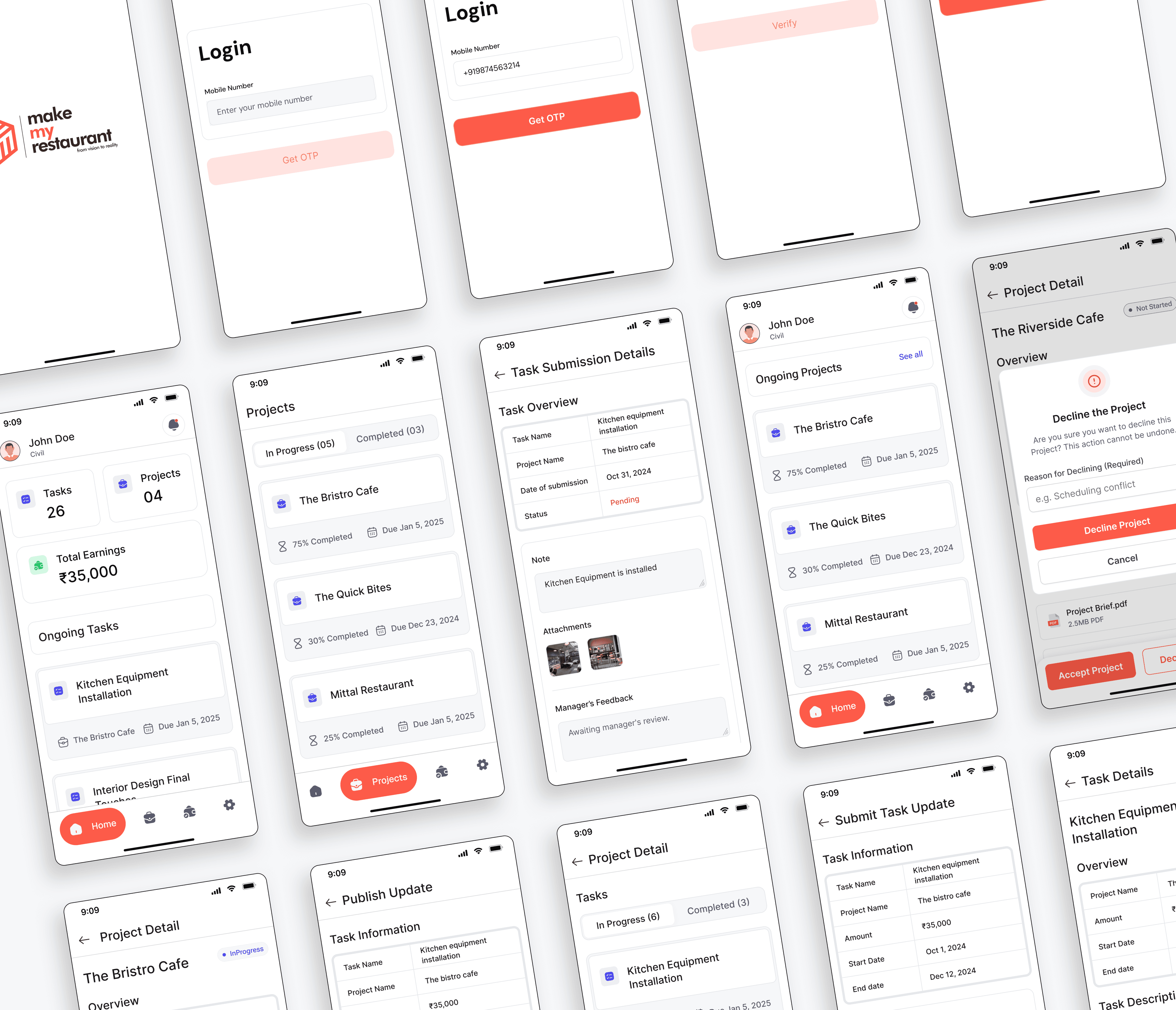
Each screen was designed with a clear visual hierarchy, intuitive interactions, and minimal friction so vendors could focus on their work, not figuring out how to use the app.

Once the core screens were ready, I built an interactive prototype. This allowed stakeholders to experience the flow firsthand, gather feedback early, and validate the experience before moving into development.
Usability Testing & Iterations
After designing the high-fidelity UI and prototype, we conducted virtual usability testing with 5 vendors to validate whether the experience was intuitive and efficient.
Objectives
Identify usability roadblocks in completing key tasks.
Observe how vendors navigate through the app.
Gather feedback to refine the design.
💡key finding
Task visibility needed a boost
Vendors wanted their current tasks front and center on the home screen.
Payment labels were unclear
The difference between “recent payments” and “expected payments” wasn’t obvious.
Daily vs final updates caused confusion
Vendors weren’t sure how and when to submit progress.
Iteration
After analyzing usability test results, I refined the design to improve usability, clarity, and accessibility.
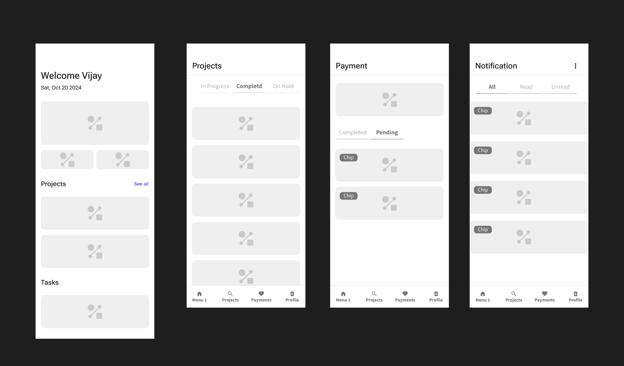
Home Screen
Improved Information Hierarchy
In the old design, earnings were emphasized at the top, but tasks and projects were placed in a secondary position.
The new design prioritizes key metrics (Tasks, Projects, and Earnings) in a structured, card-based layout, making them easier to scan.
Task-Centric Approach
Instead of listing projects with a progress bar, the updated version highlights ongoing tasks directly.
More Focused Bottom Navigation
The old bottom nav had five options, which could feel cluttered.
The new nav simplifies it with four icons, with a larger, more prominent home button for accessibility.
Improved Readability & Spacing
The "After" version uses more whitespace and padding, making content easier to read and reducing cognitive load.

Payment Screen
Removed the “Recent Payment” & “Expected Payment” Tabs
Instead of separating payments into “Recent” and “Expected,” which was confusing for vendors, I have introduced a clearer toggle between "Completed" and "Pending".
Improved Readability & Clean UI
Better use of whitespace and a cleaner card layout for payment items. Icons are simplified, making the screen less cluttered.

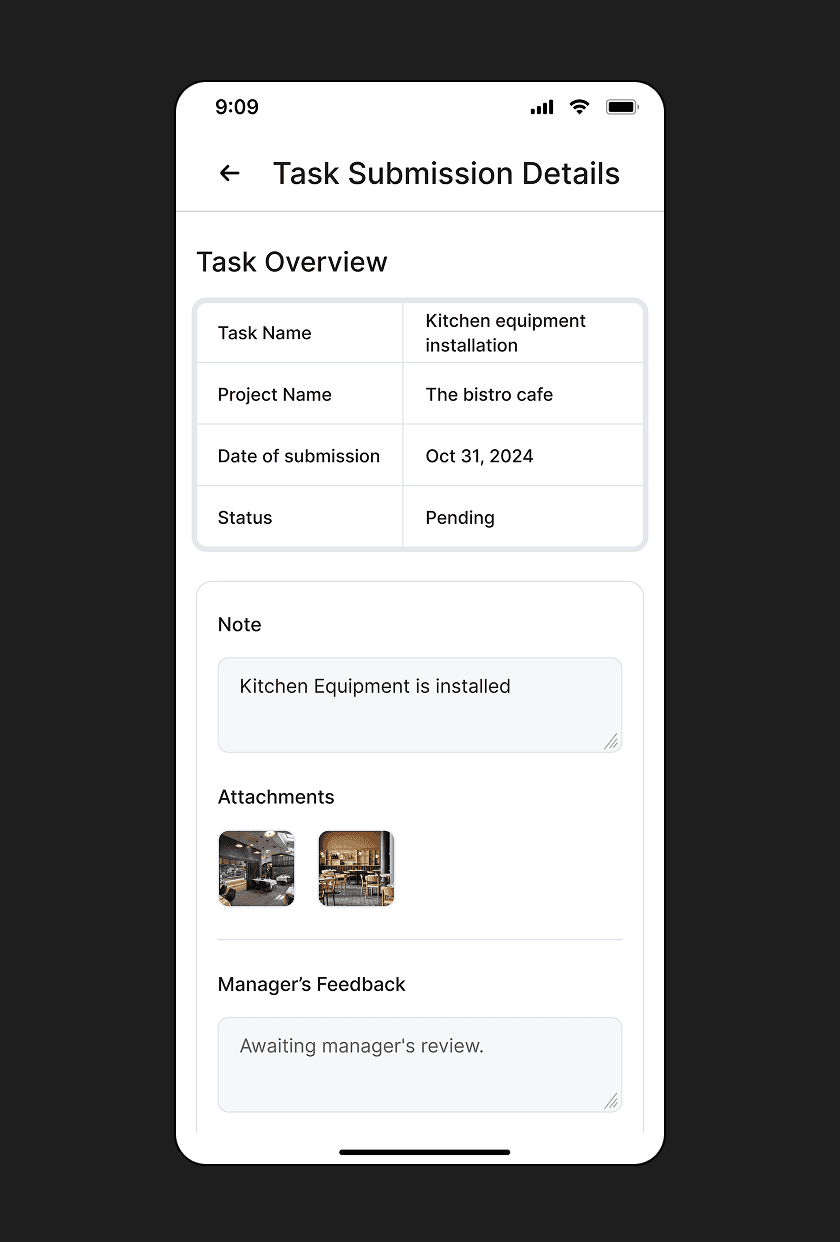
Payment Screen
Improved Information Hierarchy
Task details are now structured in a table format for better readability.
Manager’s Feedback Clarity
A dedicated "Manager’s Feedback" section clearly indicates that this is a review from the manager rather than a progress update.
Final UI Design
After multiple iterations, the final design made vendor management effortless.

Key Learnings
"Done" is better than "perfect": Focus on core user needs first, then refine over time in fast-paced projects.
Lean UX can still drive impact. Even without extensive user interviews, the right discussions and usability tests led to a functional, scalable solution.
Conclusion
Designing the Vendor Management App was a fast-paced, problem-solving challenge. The tight deadline pushed me to think strategically focusing on impactful design decisions that improved efficiency, reduced confusion, and empowered vendors.
Though still in development, this design lays the foundation for a seamless, transparent vendor management experience. The iterative feedback-driven approach ensured the final solution was user-friendly, practical, and scalable.
